These are some self branding things I'm working on. I didn't get to show these in class, but there are a few more things I would like to make for my self branding. I'm just not sure if they're working or not.
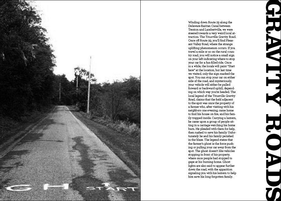
This is the editorial I did for the collaborative project. My section was on "Strange Jersey" which has a few random places in jersey that has strange activity and unexplained phenomenons.
I want people to feel happier and want to sparkle when they see this. I supposed you can say it's inspirational, though that's not what I was going for originally.
*This photo was taken by me when I was in Disney World. It's the Lights Show they have every night in the Epcot Park.
These are 5 projects I would like to try to do for this semester. The examples I'm showing are not my work. They are simply my inspiration or just something to give you an idea of what I want to try to accomplish.
For these posters, I wanted to use a typeface that flows and arrange it in a way where it appears to me moving around on the page. It isn't supposed to read as any words and they aren't supposed to be arranged to create a picture or an image of a specific object. It's just supposed to look like there is movement in the type.
I went back and took the circle idea to the next level. I still left the type plain because I want the image and information to be able to work together first. I also left it in black and white so that I don't get distracted from the design worrying about color, though I think I might like it better in just black and white. But I could also try to make one in color also if you think it might look more interesting and would inspire people more. But I'm mainly concerned with getting the design to flow really well first.